---
title: "Final Exercise"
aliases: [../final_exercise/final_exercise.html]
---
[^1]
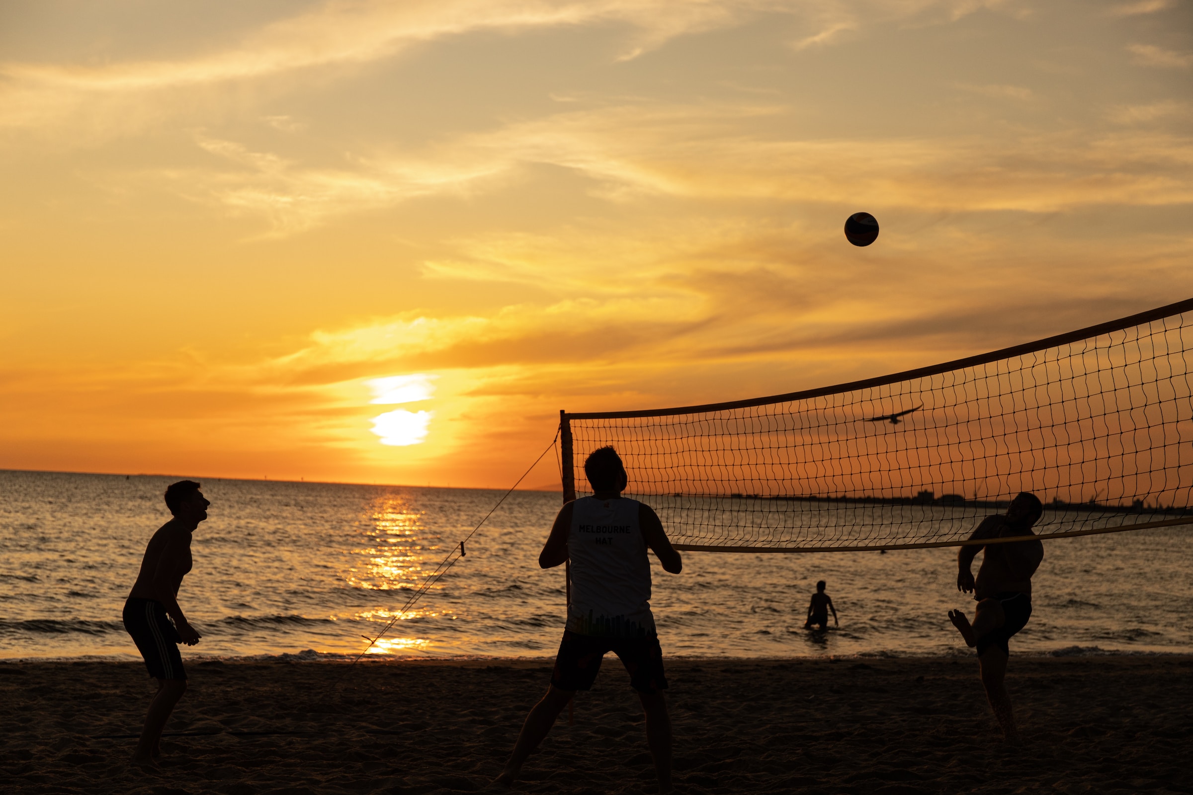
[^1]: Image by [Mitchell Luo](https://unsplash.com/de/@mitchel3uo?utm_source=unsplash&utm_medium=referral&utm_content=creditCopyText) on [Unsplash](https://unsplash.com/de/fotos/2Oazk1nJzhM?utm_source=unsplash&utm_medium=referral&utm_content=creditCopyText).
This exercise revisits most topics presented in the workshop (but will also go beyond it slightly in some cases to provide additional input).
If you are a R beginner and followed the workshop, you can do this last exercise **at the end** to test your knowledge. It will be a bit harder than the other workshop exercises to challenge you one last time and encourage you to think about concepts you might want to revisit, so don't worry if some exercises feel a bit harder, we haven't talked about everything yet.
If you already have some R experience, you can do this exercise before the rest of the workshop and use it to identify weak points to follow up on.
Use all resources at your disposal (cheat sheets, stack overflow ...), that's how you would work on a real project as well.
So, in order to provide you with a totally fresh data set, let's look at beach volleyball. The data was collected from international beach volleyball championships, and displays a lot of stats on each single match.
::: {.callout-caution icon="false"}
## Goal
For this exercise we want to focus on a simple questions: Do height differences in volleyball matter so much that taller teams have a winning advantage? If that would be the case, the mean height of the winning team should be significantly larger than the mean height of the losing team. Let's take a look!
:::
::: callout-tip
Throughout this script I will use a mixture of [`tidyverse`](../basics/tidyverse.qmd) and `Base R` code. Feel free to use the syntax you are comfortable with.
:::
## Exercise 1
### 1) Loading Data
[Download](https://lmu-osc.github.io/introduction-to-R/qmd/workflow/workflow-exercise.html#exercise-2-download-data) the data sets [`vb-w` and `vb-l`](https://github.com/lmu-osc/introduction-to-R/tree/main/raw-data) and [load the data](../load-data/load-data.qmd) into R. `vb-w` contains the stats of the winning team, `vb-l` the stats of the losing team.
::: {.callout-tip collapse="true"}
## Hints
1. Admittedly not the easiest data loading exercise. One file is a `.csv` file, the other an SPSS file (`.sav`). Take a look [here](../load-data/load-data.qmd) to see how to load them into R.
2. You need to install `haven` to load the `.sav` file.
3. You need to look at the `sep` argument in `read.csv()`: It needs to specify how the values in the `.csv` file are separated. Use a text editor to take a look into the file itself to find out what the separator should be. We have seen a similar example in [Loading Data: Exercise 2](https://lmu-osc.github.io/introduction-to-R/qmd/load-data/load-data-exercise.html#exercies-2).
:::
::: {.callout-caution collapse="true"}
## Solution
```{r}
# install.packages("haven") # Commented out, only execute if the package needs to be installed.
library(haven)
library(tidyverse) ## Will use later on
vb_w <- read.csv(file = here::here("raw-data", "vb-w.csv"), sep = " ")
vb_l <- read_sav(file = here::here("raw-data", "vb-l.sav"))

## Take a look:

str(vb_w)
str(vb_l)
```
:::
### 2) Merging
[Merge](../merging/merging.qmd) `vb_l` and `vb_w`.
::: {.callout-tip collapse="true"}
## Hint
Use the argument `by` in `merge()` to select the columns `id` and `gender` on which the data sets wil get merged.
:::
::: {.callout-caution collapse="true"}
## Solution
```{r}
vb <- merge(
  vb_l,
  vb_w,
  by = c("id", "gender")
)
str(vb)
```
If we don't put `gender` into the `by` argument, it will get duplicated with the suffix `.x` and `.y`. This happens because both data frames have a column with this name. But if we merge by this column, the function knows they belong together.
:::
### 3) Selecting Columns
[Select](https://lmu-osc.github.io/introduction-to-R/qmd/subsetting/subsetting.html#columns) only the columns from the data frames that are relevant to our 'research question'.
::: {.callout-tip collapse="true"}
## Hint
The relevant columns are: `c("gender", "l_p1_hgt", "l_p2_hgt", "w_p1_hgt", "w_p2_hgt")`.
:::
::: {.callout-caution collapse="true"}
## Solution
```{r}
vb <- vb[, c("gender", "l_p1_hgt", "l_p2_hgt", "w_p1_hgt", "w_p2_hgt")]
```
:::
### 4) Removing Missings
Remove any remaining [NAs](../missing/missing.qmd) from this data set.
::: {.callout-tip collapse="true"}
## Hint
Use `na_omit()` to remove all `NAs` at once.
:::
::: {.callout-caution collapse="true"}
## Solution
```{r}
vb <- na.omit(vb)
```
:::
### 5) Calculating Mean
Calculate the mean height by team. Add the results in two [new columns](https://lmu-osc.github.io/introduction-to-R/qmd/getting-started/the-big-picture.html#adding-a-new-column) to the `vb` data frame, one for the losing team mean height, and one for the winning team mean height.
::: {.callout-tip collapse="true"}
## Hint
You will need to calculate the mean of the two columns **for each row**. There is a function called `rowMeans()` which can do exactly that. Provide a data frame consisting only of the relevant columns as input for the function. Or you can just add the respective columns and divide by two.
:::
::: {.callout-caution collapse="true"}
## Solution
```{r}
vb$winning_height <- rowMeans(vb[, c("w_p1_hgt", "w_p2_hgt")])
vb$losing_height <- rowMeans(vb[, c("l_p1_hgt", "l_p2_hgt")])

## Or:
vb$winning_height <- (vb$w_p1_hgt + vb$w_p2_hgt) / 2
vb$losing_height <- (vb$l_p1_hgt + vb$l_p2_hgt) / 2
```
:::
## Exercise 2
Now, let's do a paired t-test comparing the mean winners height against the mean losers height.
### 1) Histogram
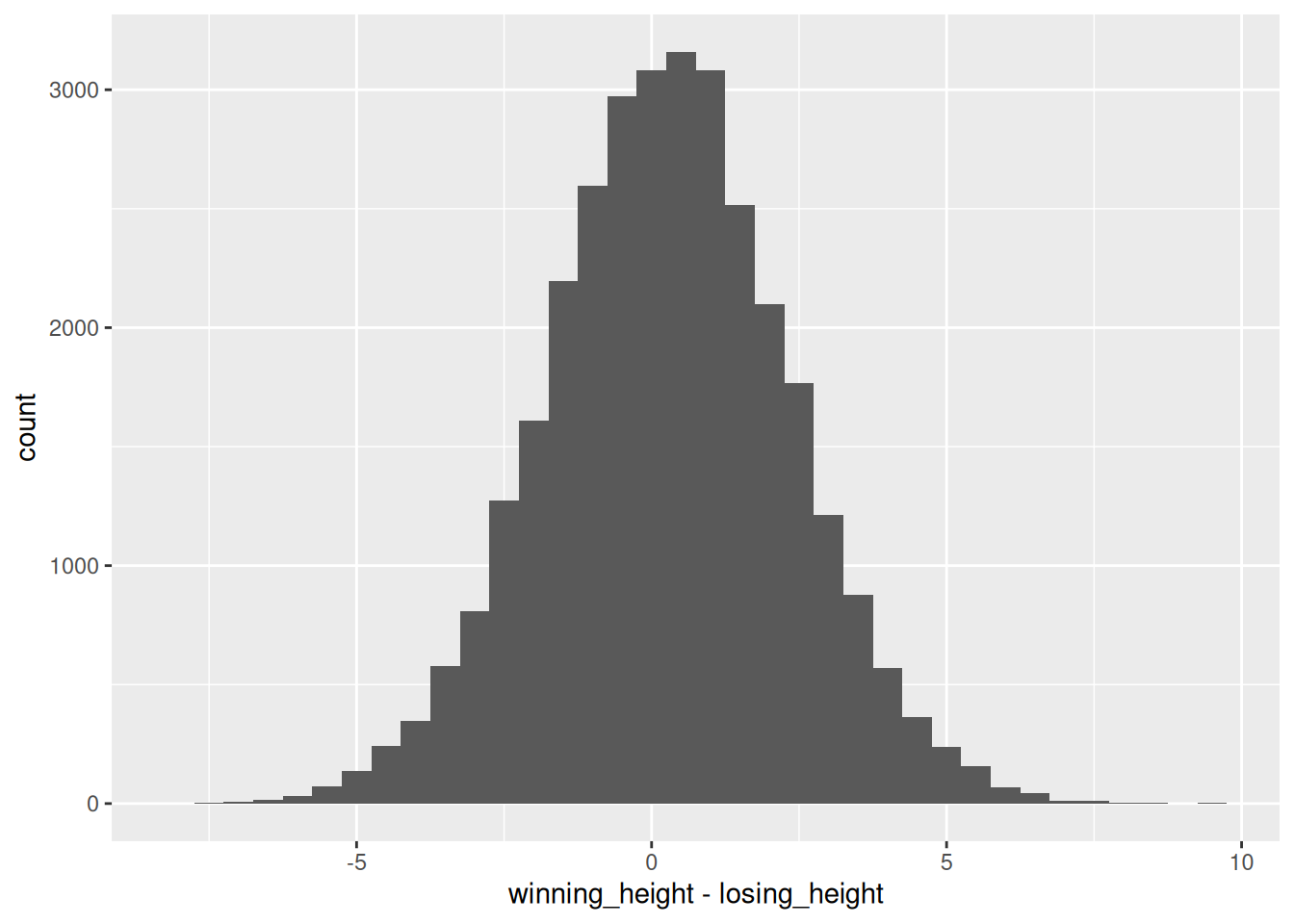
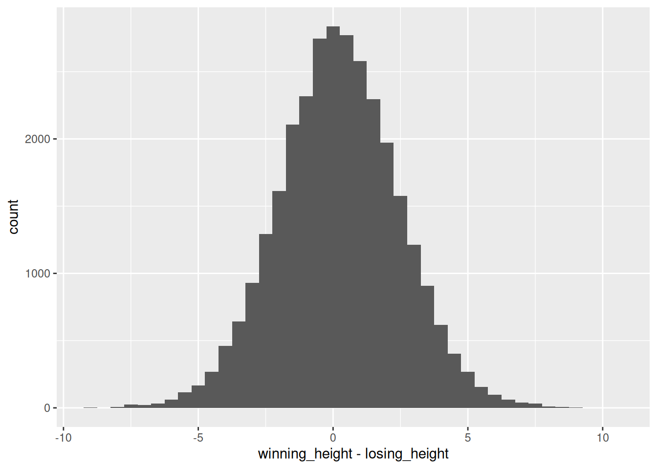
One assumption of the paired t-test is that the differences of the pairs are normally distributed. Check this assumption [visually](../plotting/plotting.qmd) by creating a histogram of the `winning_height - losing_height` difference. Use a [`for-loop`](../loops/loops.qmd) to create one histogram for the men and one for the women. You need to explicitly `print()` the plot if you want to display it from within a `for-loop`.
::: {.callout-tip collapse="true"}
1. The start of your for loop should look like this: `for(i in c("M", "W")){`. Inside, filter for men/women, and then create the plot using this subsetted data frame.
2. Use `geom_histogram()` as `geom` for your plot.
:::
::: {.callout-caution collapse="true"}
## Solution
```{r}
for (i in c("M", "W")) {
  ## Extract men/women, depending on i
  vb_gender <- vb %>% filter(gender == i)

  p <- ggplot(
    ## Build the coordinate system
    data = vb_gender,
    mapping = aes(x = winning_height - losing_height)
  ) +
    ## Use geom_histogram to build a histogram. Set the binwidth manually, so the bars get a bit smaller:
    geom_histogram(binwidth = 0.5)

  ## Explicitly print the plot, so it gets put out from the for loop
  print(p)
}
```
Hmm, so the differences in the mean team height are really small in most cases! One inch are `2.54` cm, and most height differences between the teams are not larger than `5` cm, so we probably won't see an effect. But let's proceed to confirm that!
:::
### 2) Paired t-test
Do a paired t-test comparing the winning teams height vs the losing teams height. Again use a [`for-loop`](../loops/loops.qmd) to test for men and women separately. Save the result in a [list](https://lmu-osc.github.io/introduction-to-R/qmd/data-structures/data-structures.html#honorable-mention-list), and name the list elements.
::: {.callout-tip collapse="true"}
## Hint
1. Use the function `t.test()` and set the argument `paired = TRUE`.
2. To save the result in an empty list you have created, use: `result_list[[i]] <- calculation`.
:::
::: {.callout-caution collapse="true"}
## Solution
```{r}
## Define an empty list to save your t-test results in.
result_list <- list()

## Iterate over men and women:
for (i in c("M", "W")) {
  ## Extract men/women, depending on i
  vb_gender <- vb %>% filter(gender == i)

  ## Do the t-test and save the result
  result_list[[i]] <- t.test(
    vb_gender$winning_height,
    vb_gender$losing_height,
    paired = TRUE
  )
}

result_list
```
Th p-value is `< 0.001` in both subgroups. However, we have a **very** large sample, so almost all group differences will become significant.
::: callout-note
Actually, this example would be a perfect application for [`lapply()`](https://r-coder.com/lapply-r/?utm_content=cmp-true):
```{r}
result_list <- lapply(c("M", "W"), function(x) {
  ## Extract men/women
  vb_gender <- vb %>% filter(gender == x)

  ## Calculate the t-test. Note how we don't need an empty list to save the results in, lapply() does that for us.
  t_test_result <- t.test(
    vb_gender$winning_height,
    vb_gender$losing_height,
    paired = TRUE
  )

  ## Explictly return the result:
  return(t_test_result)
})

## We still hav to name our resulting list to know what is what:
names(result_list) <- c("M", "W")
```
The output of `lapply()` is always a list, so we don't have to define an empty list in the beginning of the loop.
:::
:::
### 3) Functions
Look at the mean differences. Not very big, right? Let's calculate a standardized effect size, Cohen's *d*! We can do that for a paired t test by dividing the mean of the differences of both groups by the standard deviation of the difference of both groups:
$d=\frac{mean_{Diff}}{sd_{Diff}}$
with *Diff* as the differences of the paired sample values.
Write a [function](../functions/functions.qmd) to do that, then add it to your loop so Cohen's *d* gets printed into your console. You can use the function `lsr::cohensD()` to check your function.
::: {.callout-caution collapse="true"}
## Solution
```{r}
# install.packages("lsr") # Can be used for checking the own calculation

## Function for calculating Cohen's d
cohens_d <- function(group_1, group_2) {
  ## Calculate the difference
  diff <- group_1 - group_2

  ## Calculate d accoring to our formula
  d <- mean(diff) / sd(diff)

  return(d)
}

for (i in c("M", "W")) {
  ## filter men/women
  vb_gender <- vb %>% filter(gender == i)

  ## Paired t-test
  result_list[[i]] <- t.test(
    vb_gender$winning_height,
    vb_gender$losing_height,
    paired = TRUE
  )

  ## Our Cohen's d function
  d <- cohens_d(
    group_1 = vb_gender$winning_height,
    group_2 = vb_gender$losing_height
  )

  ## Cohen's d according to the lsr package:
  d_2 <- lsr::cohensD(
    x = vb_gender$winning_height,
    y = vb_gender$losing_height,
    method = "paired"
  )

  ## Print d
  print(paste("My Cohen's d:", round(d, 3)))
  print(paste("lsr Cohen's d:", round(d_2, 3)))
}
```
So, following Cohen's conventions, this are negligible effect sizes, so the height differences in professional volleyball are probably not that important for the outcome of the match. Not that surprising all together, because the height differences were very small in the first place, and there are probably much more important factors to winning a volleyball match than a minimal height advantage.
:::
## Exercise 3
### 1) Reshaping
[Reshape](../format/format.qmd) the `vb` data frame (with both men and women in it) into long format, so all heights can be found in one column, with the winning/losing information in another column.
::: {.callout-caution collapse="true"}
## Solution
::: tidy
```{r}
vb_long <- vb %>%
  pivot_longer(
    cols = c("winning_height", "losing_height"),
    names_to = "result",
    values_to = "mean_height"
  )

head(vb_long)
```
:::
:::
### 2) Plotting
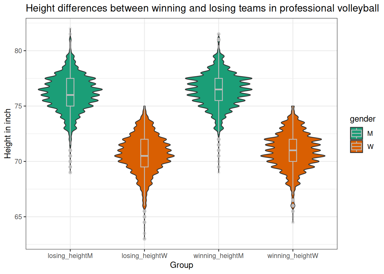
[Use `ggplot`](../plotting/plotting.qmd) to build a violin plot showing the winners and losers height distribution by gender. Violin plots are similar to box plots but have the advantage of conveying more distributional information. If you want, you can also add a small box plot on top of the violin plot to have the advantage of both (you can get some [inspiration](https://r-graph-gallery.com/violin_and_boxplot_ggplot2.html) on how to do that). Give meaningful axis labels and a plot title.
::: callout-tip
## Hint
We want four violin plots/box plots in the end. Two for the winning teams (men, women), and two for the losing teams (men/women). The easiest way to achieve this is to [build a new column](https://lmu-osc.github.io/introduction-to-R/qmd/getting-started/the-big-picture.html#adding-a-new-column) containing the winning information and the gender in one pasted string. This new column can then be used as the x axis. This is not necessarily required, but makes it easier to lay the boxplot on top of the violin plot.
:::
::: {.callout-caution collapse="true"}
## Solution
::: tidy
```{r}
## Build a new column that can be used as x axis.
vb_long <- vb_long %>%
  mutate(group = paste0(.$result, .$gender))


## Build the coordinate system
ggplot(
  vb_long,
  mapping = aes(
    x = group,
    y = mean_height,
    fill = gender
  )
) +
  ## Violin plot:
  geom_violin() +
  ## Boxplot with some additional specifications:
  geom_boxplot(
    width = 0.1,
    color = "grey",
    alpha = 0.2
  ) +
  ## New colour palette:
  scale_fill_brewer(palette = "Dark2") +
  ## New theme:
  theme_bw() +
  ## Labels:
  ggtitle(
    "Height differences between winning and losing teams in professional volleyball"
  ) +
  ylab("Height in inch") +
  xlab("Group")
```
:::
:::
## The End
Impressive, you've finished the final exercise! If you really did it in the end of the workshop, that's it, you should be pretty proficient in working with R now. Take a look at some of the [Resources](../resources/resources.qmd) I have assembled if you want to to build on the foundation you just laid. If you have done this exercise in the beginning to test your knowledge, you can decide what to do next: Did you new everything already? Then also take a look at the [Resources](../resources/resources.qmd). Or do you want to follow up on some topics (if you haven't already). Then you can use the links in this chapter to navigate there.